The Day One editor on Android, rewritten from scratch ✳︎ one designer, one developer, one month.
The surface everyone touches
Nothing in Day One gets used more than the editor. Every entry starts there, and for years the Android app wrote entries through Aztec, an aging rich text editor that never quite felt at home. I wanted an editor that was ours, something native and fast, built in the app's design language and rethought from the ground up rather than reskinned.
One month, two people
A developer and I took it on as a sprint, one month to redesign and rebuild the entire editor, every formatting option and every attachment type, shipping piece by piece while people kept journaling in it. Working that close to the implementation meant decisions landed the same week they were made. The month closed at 37 pull requests, 32 in the app and 5 on the backend.
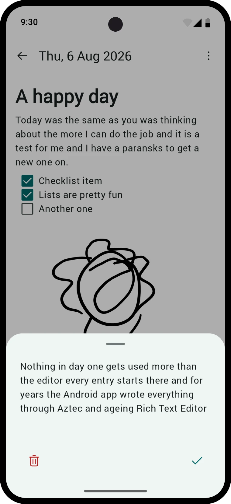
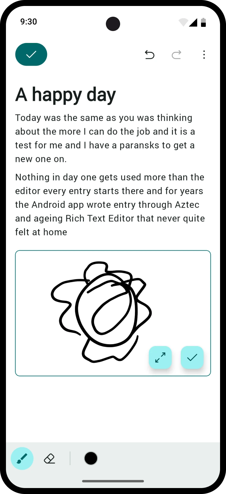
A mode for writing, a mode for reading
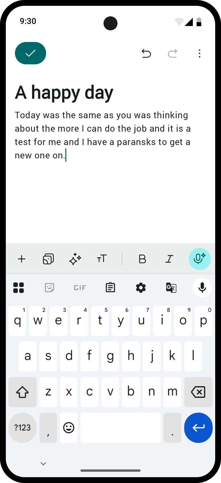
The old editor was always editing, and Back meant whatever it meant. The rewrite splits writing from reading, and in edit mode the top corner holds a primary checkmark instead of a back button, so finishing an entry is an explicit accept. It sounds small. It changes how safe the whole editor feels.
Formatting that knows where you are
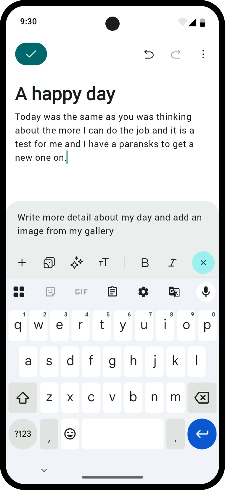
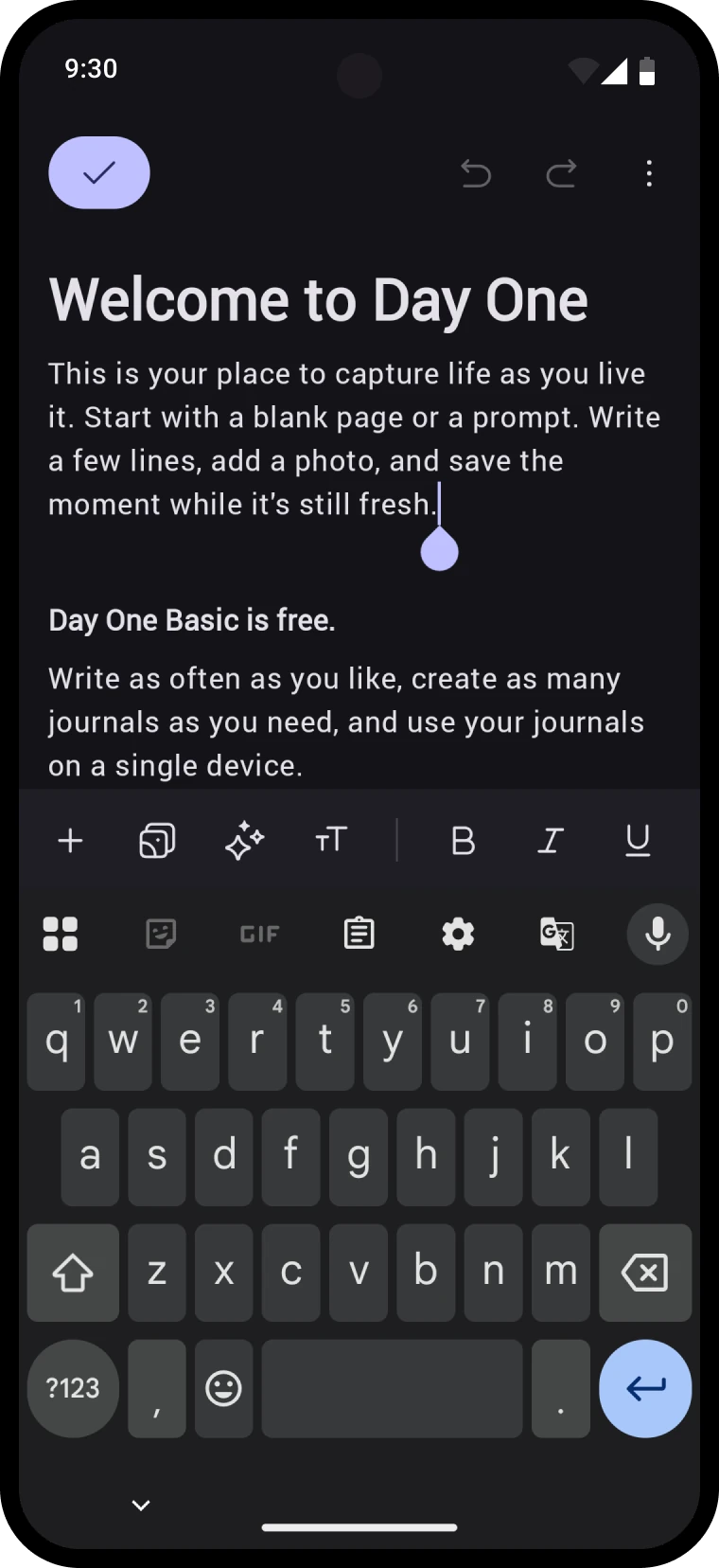
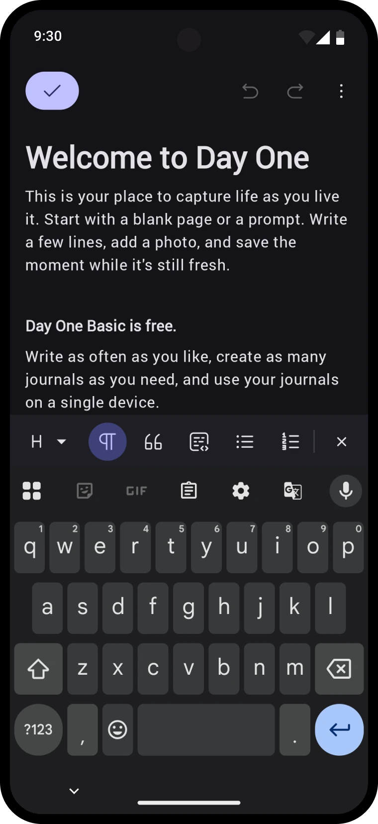
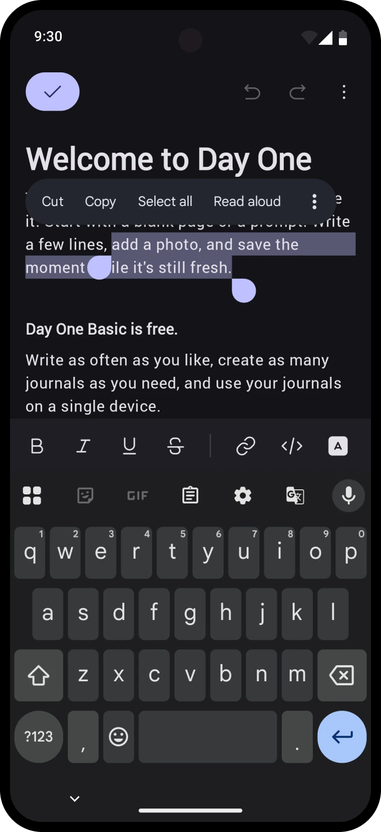
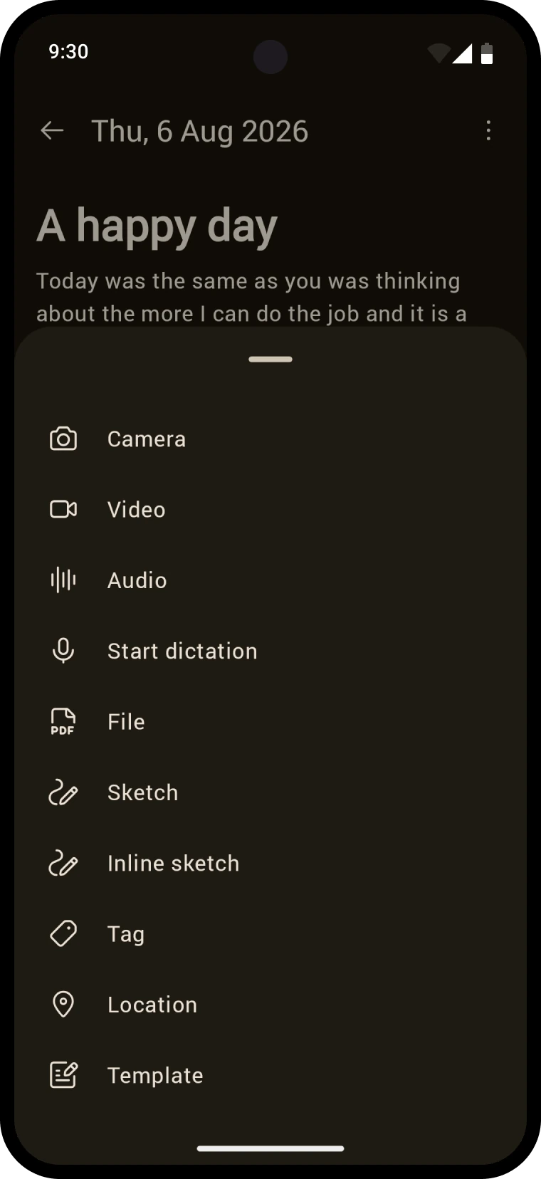
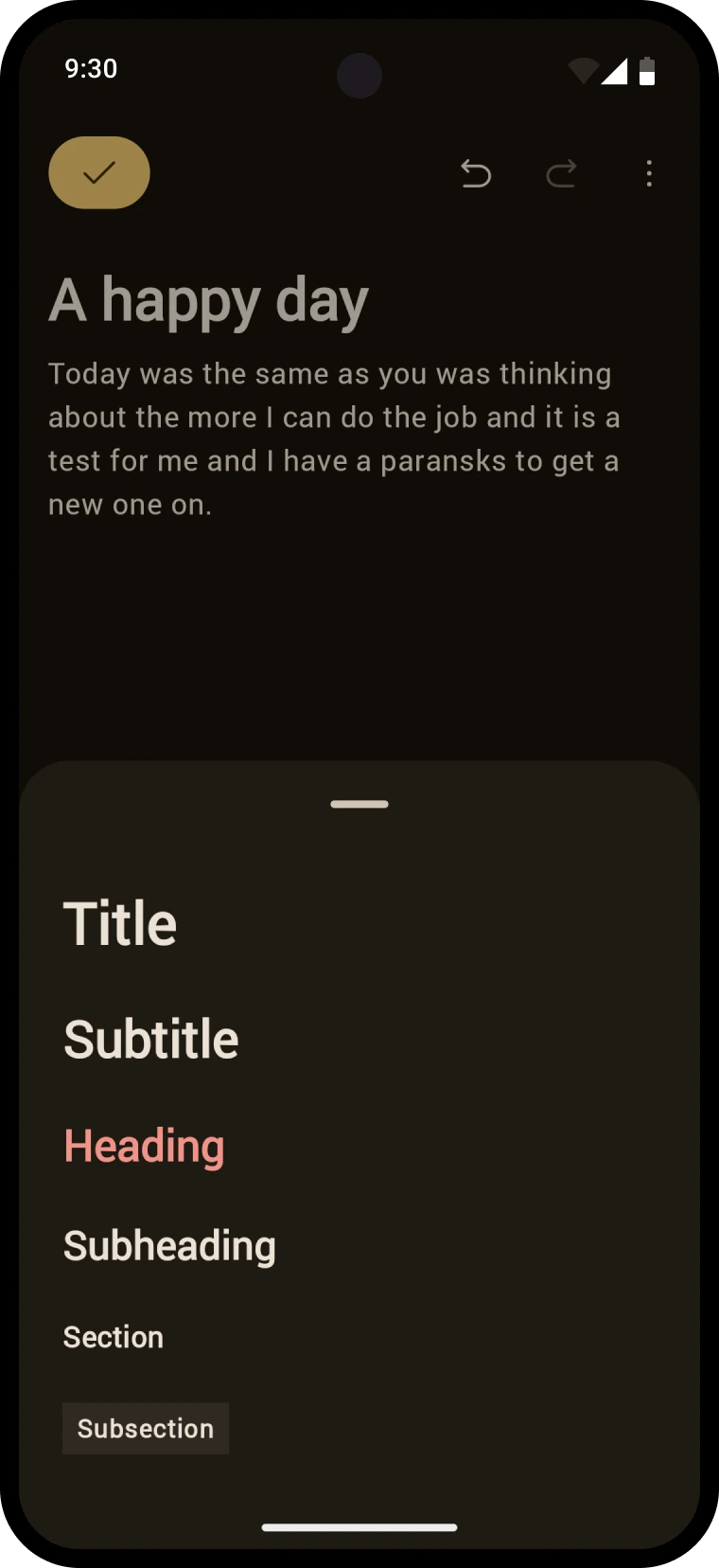
Before, every formatting option was on screen all the time. I split them into three groups: options that only make sense with a selection, structural options like headings and lists that live under a menu, and immediately useful options that follow context. In a list you see indent. In a paragraph you see bold and italic. That contextual group also carries photos, attachments, and AI suggestions, so the row you actually touch stays short. The editor now inherits the journal's color tones too, and every text style maps to Android's named typographic styles.
Blocks all the way down
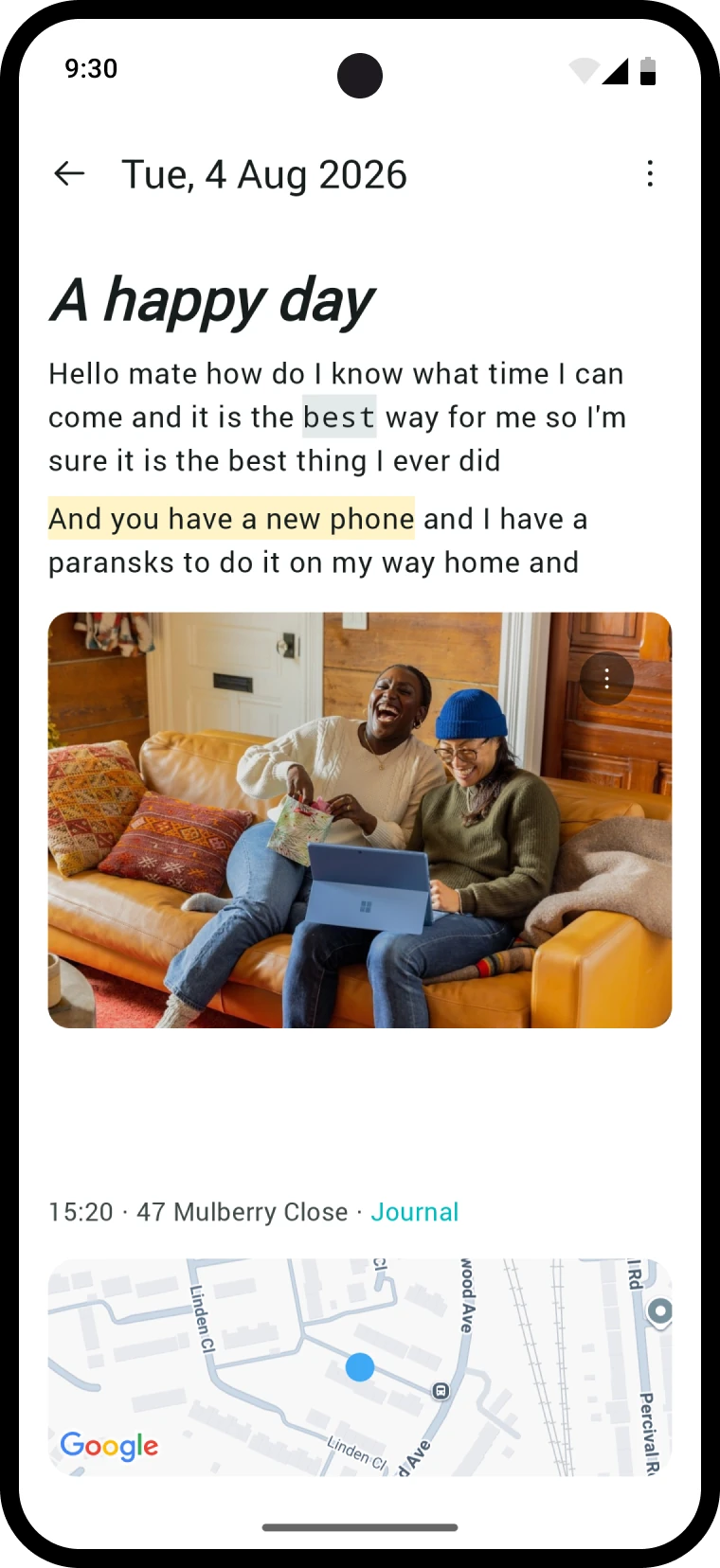
Under the hood it became a block-based editor, closer in spirit to Google Keep than to one long text field. Blocks unlock reordering, so paragraphs, images, and audio can move anywhere in the entry. The trade-off is that selecting across blocks gets hard. We took that trade knowingly, and shipped cross-block selection later anyway.
More than text
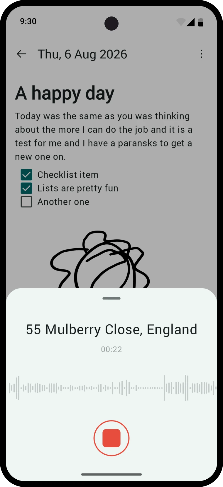
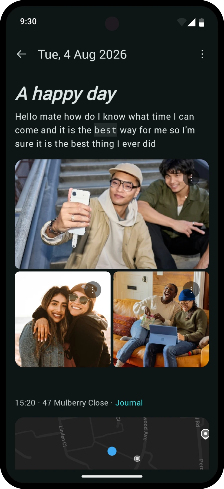
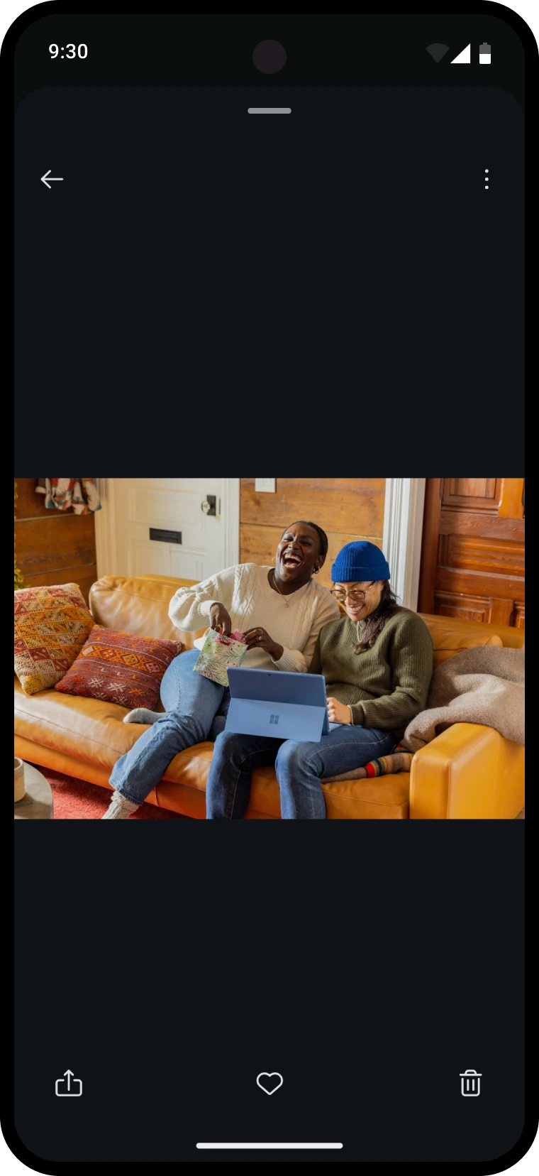
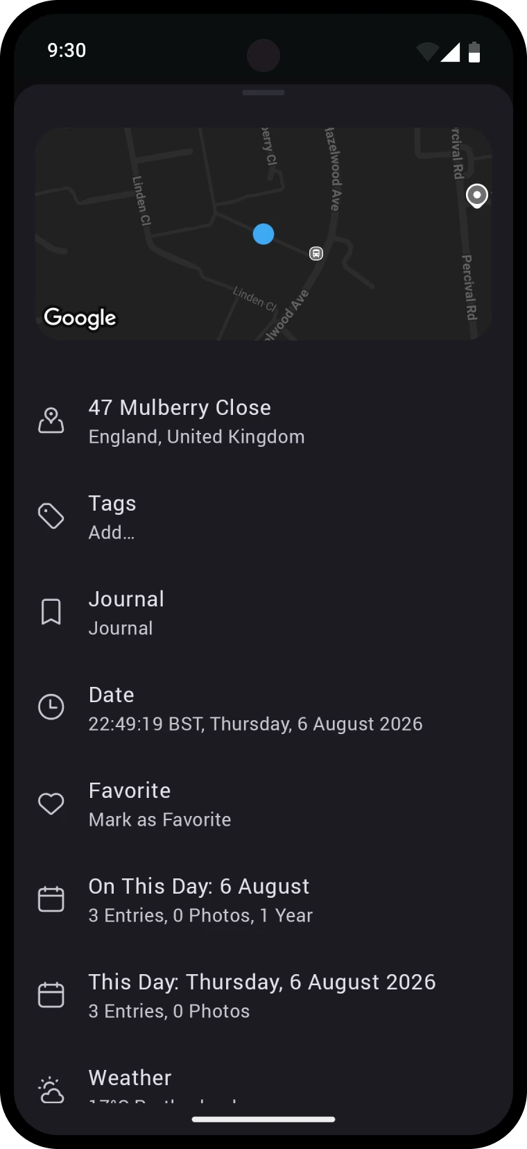
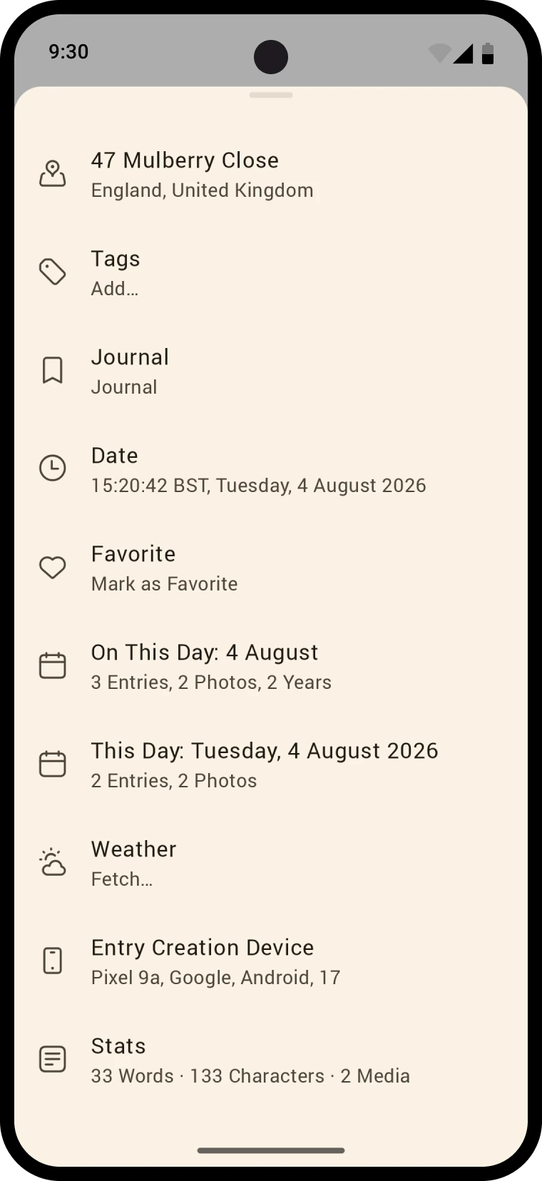
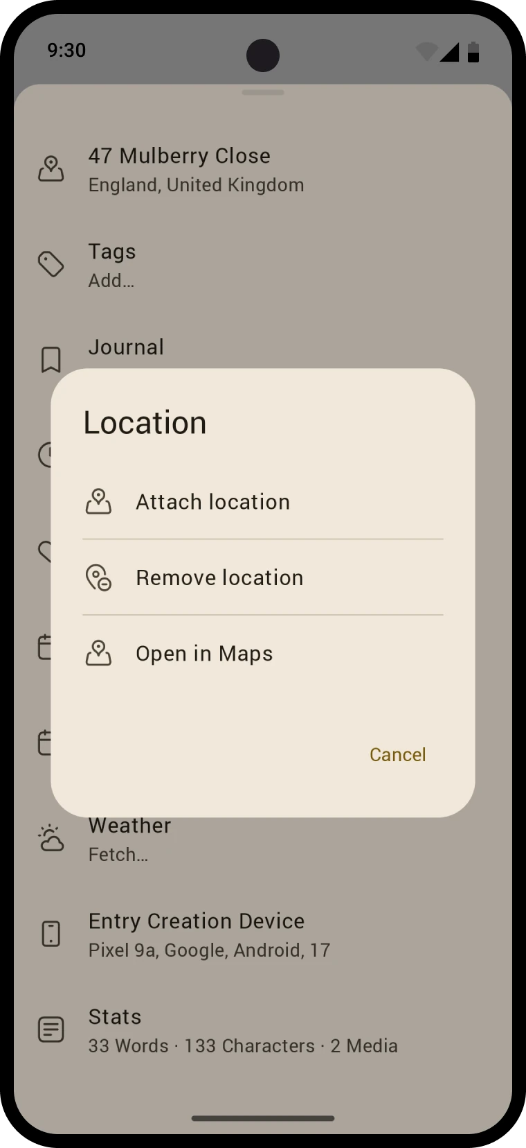
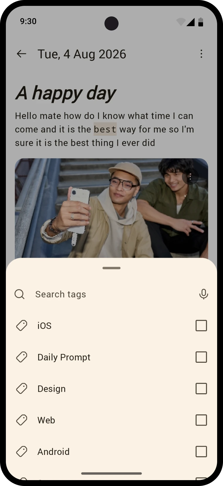
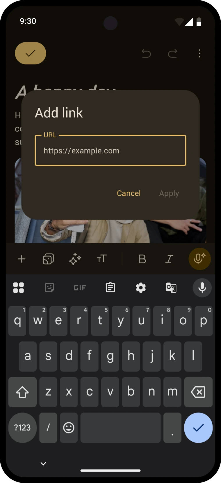
A journal entry is more than text, so the editor treats everything else as first class too. Audio records inline and embeds in the entry. Tags, location, and entry details live in Material sheets one tap away. All of it native, all of it in the app's design language.
A voice that can edit
The editor also gained an AI voice mode that takes agentic turns. It can read your entry, search it, and edit it through tool calls, so all you have to do is ask. The goal was entry omniscience and omnipotence, an assistant that sees everything and can change anything on your behalf. You talk, it journals.
"He's probably the best designer I've ever worked with. As an Android developer I appreciated his knowledge of the platform and that he treated all platforms as equal. I feel like we could work together instead of against each other and the result reflected that."— Vojta Smrček, the developer I built it with