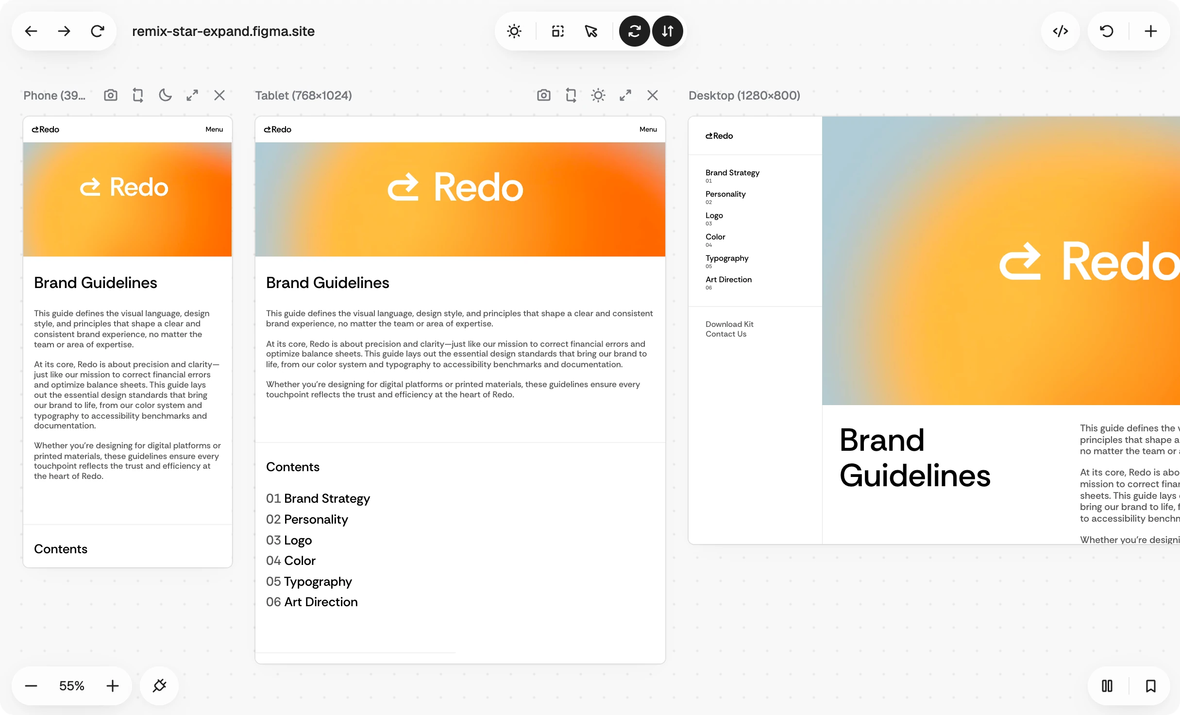
Responsive Tester shows a page at every screen size at once ✳︎ a row of synced viewports you drive together, with CSS edits that land in every breakpoint.
Driving every screen at once
Testing responsive work usually means resizing one window over and over. Responsive Tester lines up phones, tablets, and desktops side by side and keeps them in sync. Click, hover, type, or navigate in one viewport and every other one follows. The hard part is that the same element sits in a different layout on every screen, so matching is verified per interaction. A synced action either lands on the right element everywhere or it doesn't fire.
Edits that land in the right breakpoint
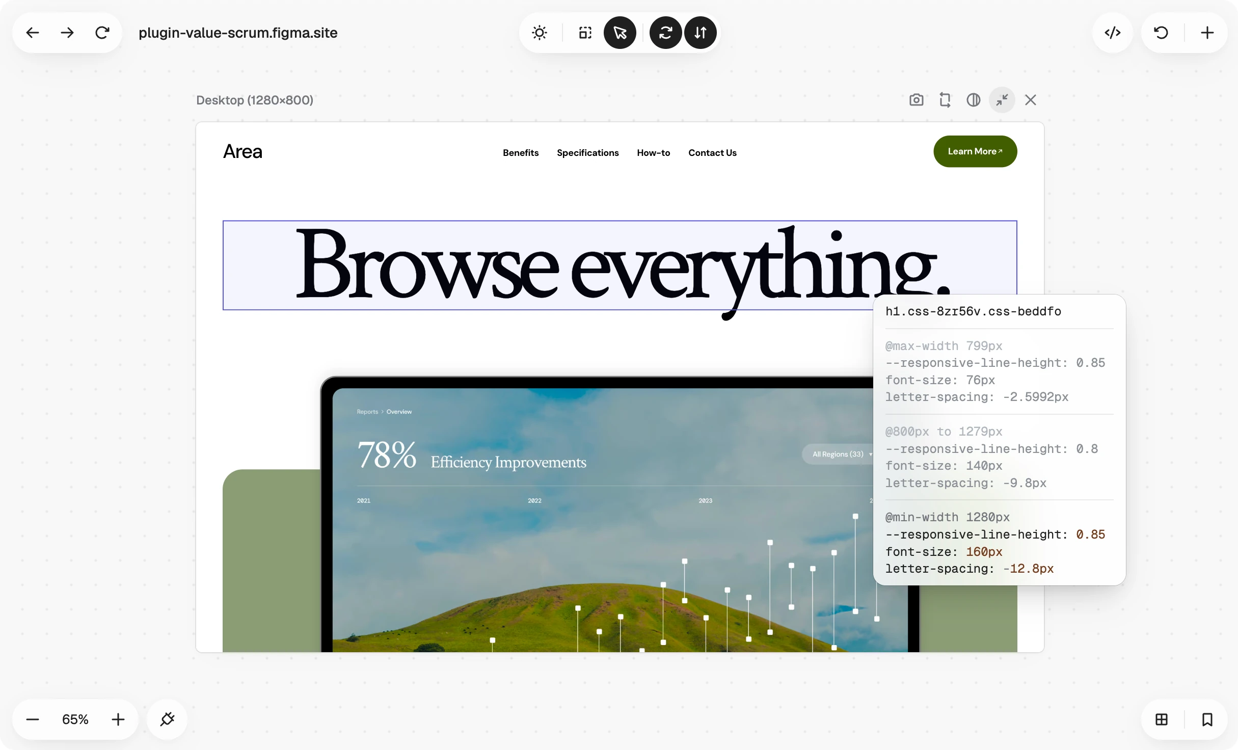
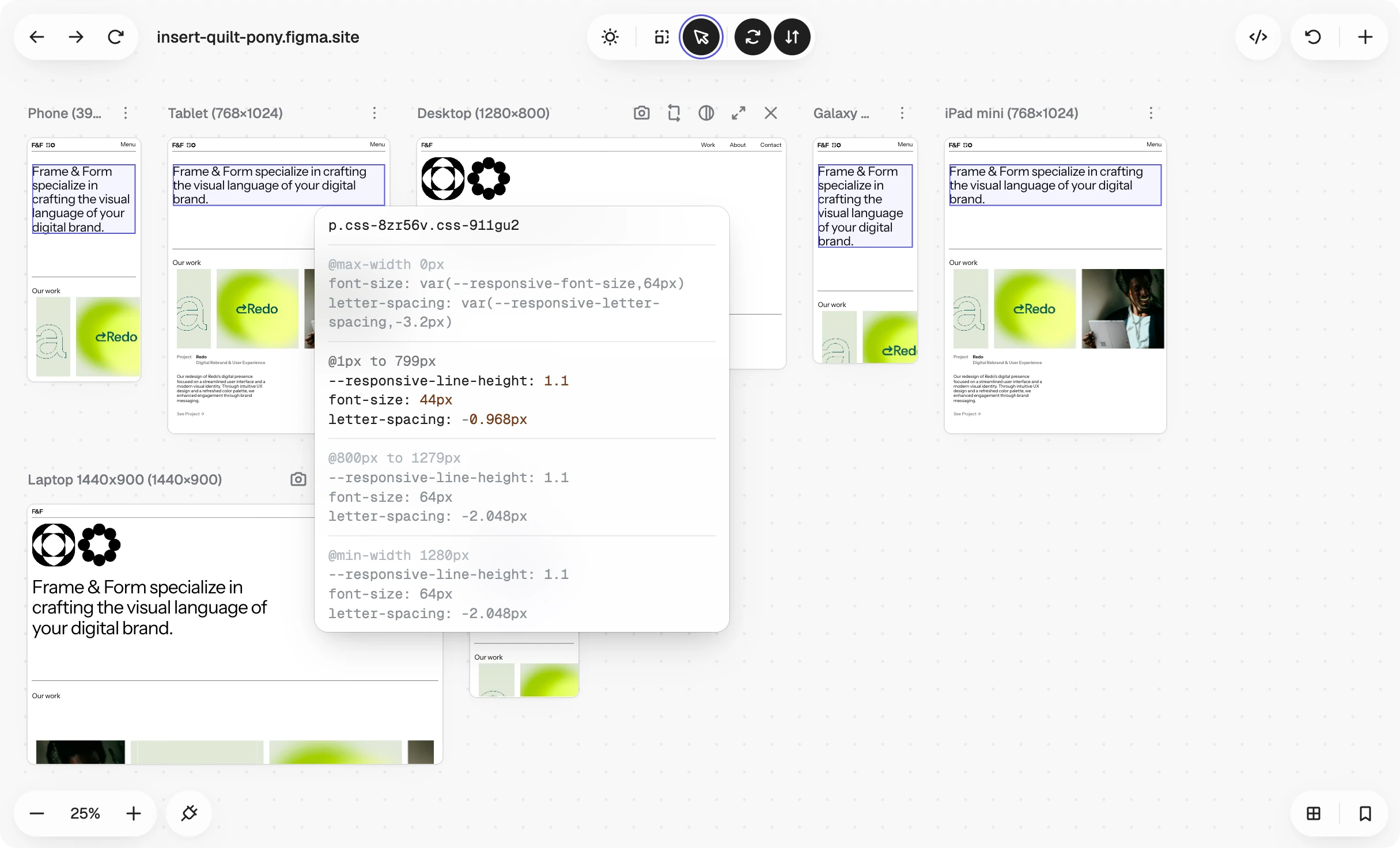
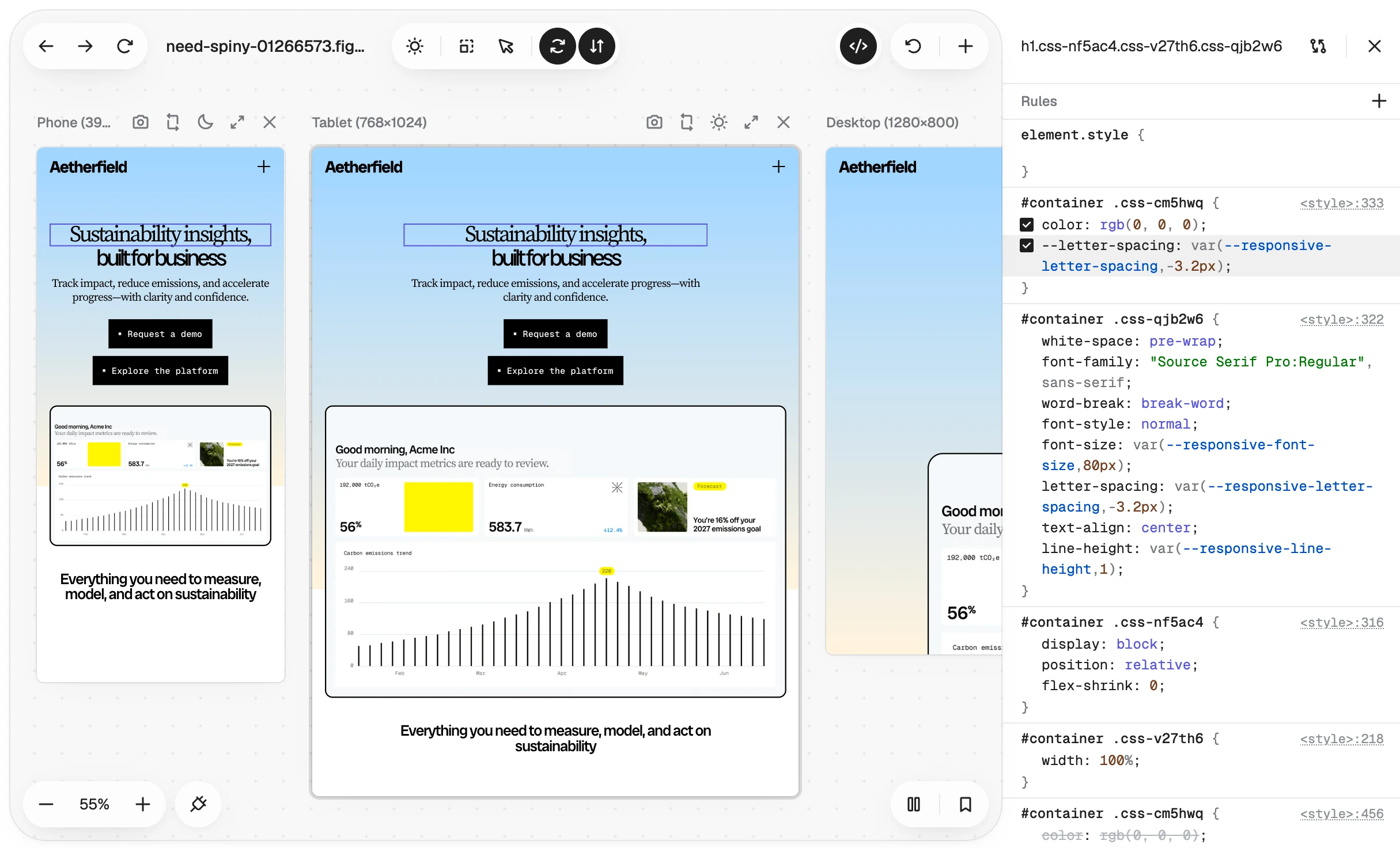
The live CSS editor understands media queries. Hover any element and a floating inspector audits it across the page's breakpoints, showing just the properties that change between widths and highlighting the segment you're in. Pick an element, change a rule, and the edit lands in the breakpoint it belongs to, applied across every viewport at once. You can force pseudo-states like hover and focus, and undo and redo every change. It runs on the same editing engine I built for Screen Ruler, maintained once and shipped in more than one product.
Meeting the page where it is
Instead of guessing which widths matter, the extension reads the page's own media rules and builds matching viewports in one click. Sites that refuse to load in frames get handled too, so it works on real pages rather than demo-friendly ones. It launched this year, so the numbers story is still being written.